Important Design Considerations (and Hidden Tradeoffs) for Glass Guardrails
When you look at a guardrail, what do you see? Maybe you look at the design, maybe you look at the materials and finish, or, maybe you just look at it as a practical necessity for everyone’s safety. Well, if you agree with the latter then you are not alone, but, if you are a part of the glass industry you probably look at guardrails differently.
To us glass nerds, a guardrail is nothing short of an amazing opportunity. It can be beautiful, it can be sleek, it can be bold or minimalist. In short, a glass guardrail is a design choice that can make or break any space. Because of this, our industry is made up of many engineers, designers, architects, fabricators, and many manufacturing companies whose entire purpose is to create new ways to connect these glass guardrails back to the existing structure. Whether it’s wood, steel, concrete, or even more glass, there are teams of people constantly trying to figure out better and prettier ways to make these guardrails stand out.
Today, thanks to all of these individuals and companies, we live in a world where architects and designers can dream big and design anything. Whether the guardrail is meant to blend into the design or make a statement, it’s all possible.
But, as is the case with any design choice, there are a lot of factors that need to be considered to ensure it has balance. What does that mean? It means that both the aesthetic choices and the actual physical user experience must be considered. That’s right, user experience is a thing in architectural design.
It is easy to make a choice based on what we like, or what is easy. Or maybe we make choices that are based on budget. Often, we have few choices based on the substrates, timelines, available products, etc. but for the sake of this article let’s pretend we have free reign. So the real question becomes, what is more important: how it looks, how it was made, or how it feels to those who interact with it? That is what we mean by balance.
We’ll share an example of a unique design for an interior staircase and show you why there’s more to it than meets the eye. By the end of the article you’ll understand why a design that’s eye-catching for the general public may be headache-inducing for a glazing professional.
Beautiful Architecture or Terrible Mess?
It really depends who you ask.

This unconventional design choice presents another problem related to the user experience.
The two drawings below were made for comparison: the first drawing represents this particular guardrail, while the second is a more typical glass guardrail design. You can see that the height of the glass in relation to the user changes as they move up or down the staircase. Now, some people may not mind this at all, but others may feel strange or even claustrophobic being completely enclosed by the guardrails on either side.
Did the architects/designers test this design with users before implementing it? That’s an important step in the design process when using an unconventional design.

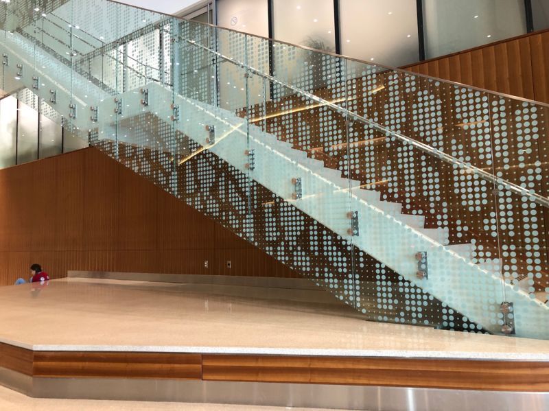
The glass design above is creative and looks pretty cool. But there’s a lot behind the design that the untrained eye wouldn’t see.
The first thing to note is that the installation of this guardrail involved many different types of professionals working together (not just architects and installers). The glazing industry is composed of engineers, designers, fabricators, and manufacturers as well. There are companies in this industry whose entire purpose is to devise new ways to connect glass guardrails to the supporting structure (in this case the staircase).
There are many factors that come into play when figuring this out. For example, the right type of connection depends on the construction material used for the structure, which is commonly wood, steel, concrete, or sometimes even glass. But thanks to many fairly recent innovations in the industry, we live in a world in which architects and designers can dream big and make pretty much any design (within reason) a reality. Still, it’s important for designs to balance aesthetic and practical considerations, which includes ease of fabrication and the user experience.
Is it more important for a structure to look good, or fulfill its function?
Let’s consider the positives of the design.
First of all, the pattern on the glass seems well thought out. It permits some visibility while at the same time concealing or taking attention away from the structure itself (the staircase). The low-iron glass is another good choice because it allows the white ink on the glass to stay true and leaves the uncovered areas clear and free of the minty nature of regular glass.
Now what about the negatives?
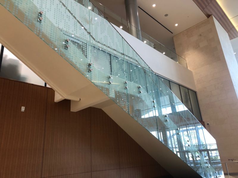
This guardrail is made up of 13/16” laminated glass with a printed pattern on the second (#2) glass surface. This means that for every segment we see, two identical pieces of glass were needed. This is where things get a bit tricky.
Making identical pieces can be a real challenge. The reason for this is allowable tolerances: even small 1/16” differences in size or hole locations here and there can add up and lead to fabrication problems. And, unfortunately, for this particular design, since the attachment points are inconsistent (see photo below), every pane is designed for a particular location on the staircase, so precision is even more important. Which can impact cost and timelines
Parting Thoughts
Always remember that there’s a lot more to good design than aesthetics. You have to keep front-of-mind practical considerations like user experience and ease of fabrication.
The example presented in this article represents a case in which ease of fabrication and the user experience were sacrificed for an aesthetic choice. It may or may not have been the right decision, but it’s important to understand and accept the trade offs.
If making design choices for aesthetic reasons as this architectural design team did, you need to recognize that there will be fabrication challenges, and there will be some users who do not appreciate (even hate) your design. While it’s impossible to please everyone, you still need to understand the drawbacks and likely criticisms of your design.
Be sure to stay up to date with our latest articles by following us on LinkedIn. You can also subscribe to our YouTube channel for lots of great how-to content related to glazing.
